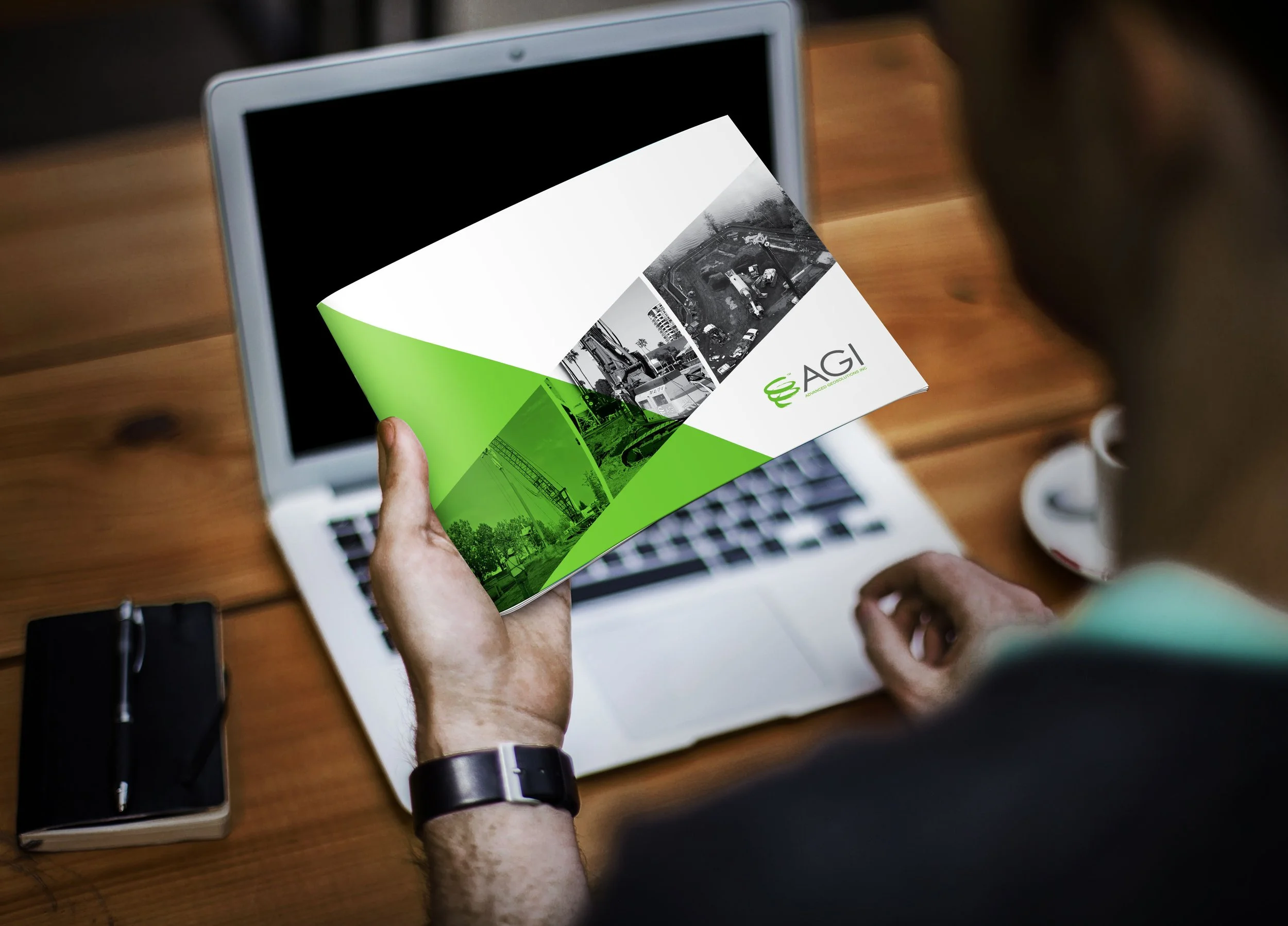
trade show brochure
Advanced Geosolutions, Inc.
Blasting apart from competitors
During my time as Art Director for Berkeley, CA based Two Hats Consulting, we took on a print project for AGI, a geotechnical contractor company.
They wanted to truly stand out from their competitors, whose branding and marketing products often had very similar colors, fonts, and imagery. In response, I created a visually fresh, power brochure with an industrial touch and contemporary flair.
Goals:
Stand out from competitors at trade shows
Showcase services and reputation
Engage people to pick it up
Problems / Solutions
Problem: 95% of competitor brochures look the exact same
Solution: Identified new opportunity for innovation in this particular field—employed strong diagonals, tons of clean white space, energizing angles, large washes of brand color, lots of white space
Problem: Together on a page, images were too busy; too many competing colors
and texturesSolution: Create visual cohesion and focus by converting images to black/white, also adding to industrial effect


AGI returned from their next trade show raving about the high level of audience engagement with their brochure - they almost ran out!

