growth + UX design
Adobe Creative Cloud
“Which App is best for my task?”
As a Staff Designer on the Creative Cloud Growth Team at Adobe, I worked with product managers and XFN teams to design and execute a variety of A/B and product-led growth experiments that drive activation, retention, and engagement of Creative Cloud products.
Behind the scenes ↓
As a growth designer, focused on iteration and testing, I had to get scrappy and creative with the limited resources I had. Instead of having all new media created or at my fingertips, I had to source all my assets from pre-existing creative. Or create my own, which I often did, especially for this project.
——
For this project, I taught myself how to edit short-form videos with Adobe Premiere Pro, and animate and add effects in Adobe After Effects. I picked a music track, synced it to the video, and boom - the “Which App” home page sizzle real was born.
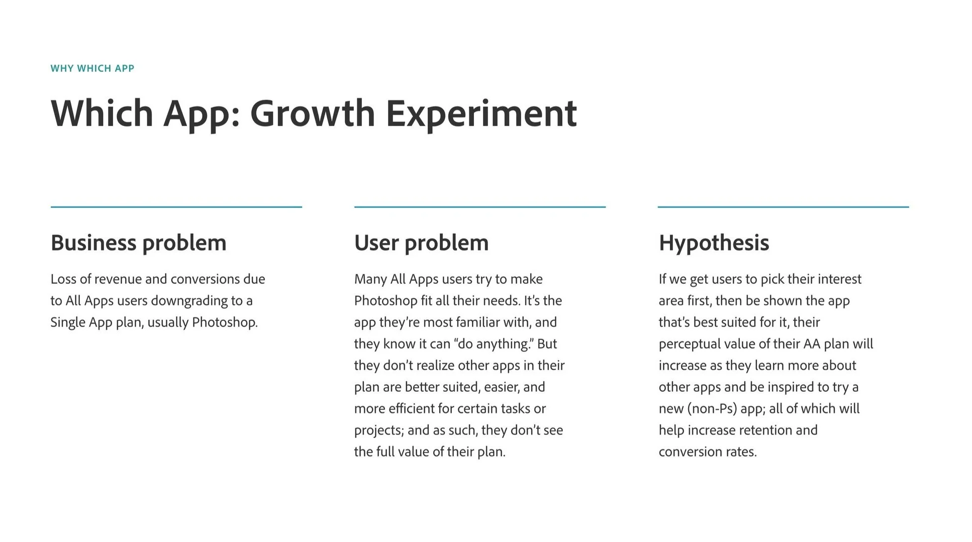
What started as a Creative Cloud growth experiment in Q4 2021 that didn’t reach stat sign became my personal passion project in 2022—”Which App.”
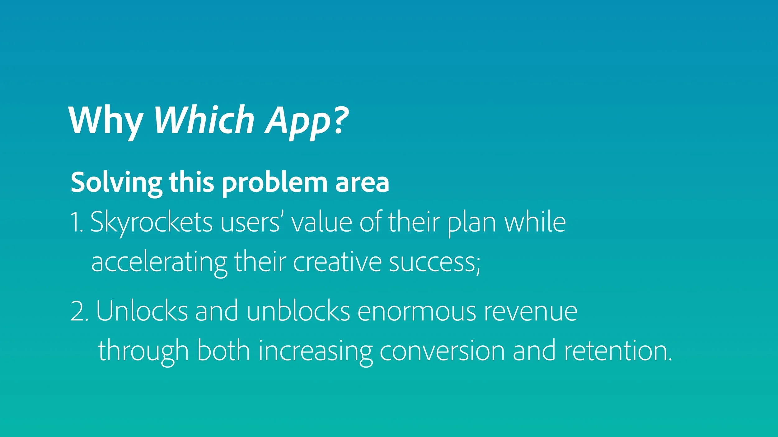
I believed that if we could solve and unblock a critical user problem area, we could both meet fundamental user needs and significantly increase key business metrics. In 2022, I rallied the Growth team to create the next version.
My role
Design Lead - executed my personal vision and strategy backed by research, Adobe data, and years of growth experiments
Collaborated with and coordinated Product Managers, designers, and XFN partners to build and launch one of the biggest, most complex growth experiments
Networked extensively to acquire asset files from various Creative Cloud app and product teams, including Photoshop, Lightroom, Premiere Pro
Delegated tasks to and collab’d with design teammate
Collab with developer to address blockers, create new solutions, and execute pixel perfect designs
Wrote copy and provided copy direction for content strategist/copywriter
Conducted user research and analysis, synthesizing it into actionable insights implemented into next iteration
and thus was (re)born
“Which app is best for my task?”
W H E R E W E S T A R T E D
“Which App” v1
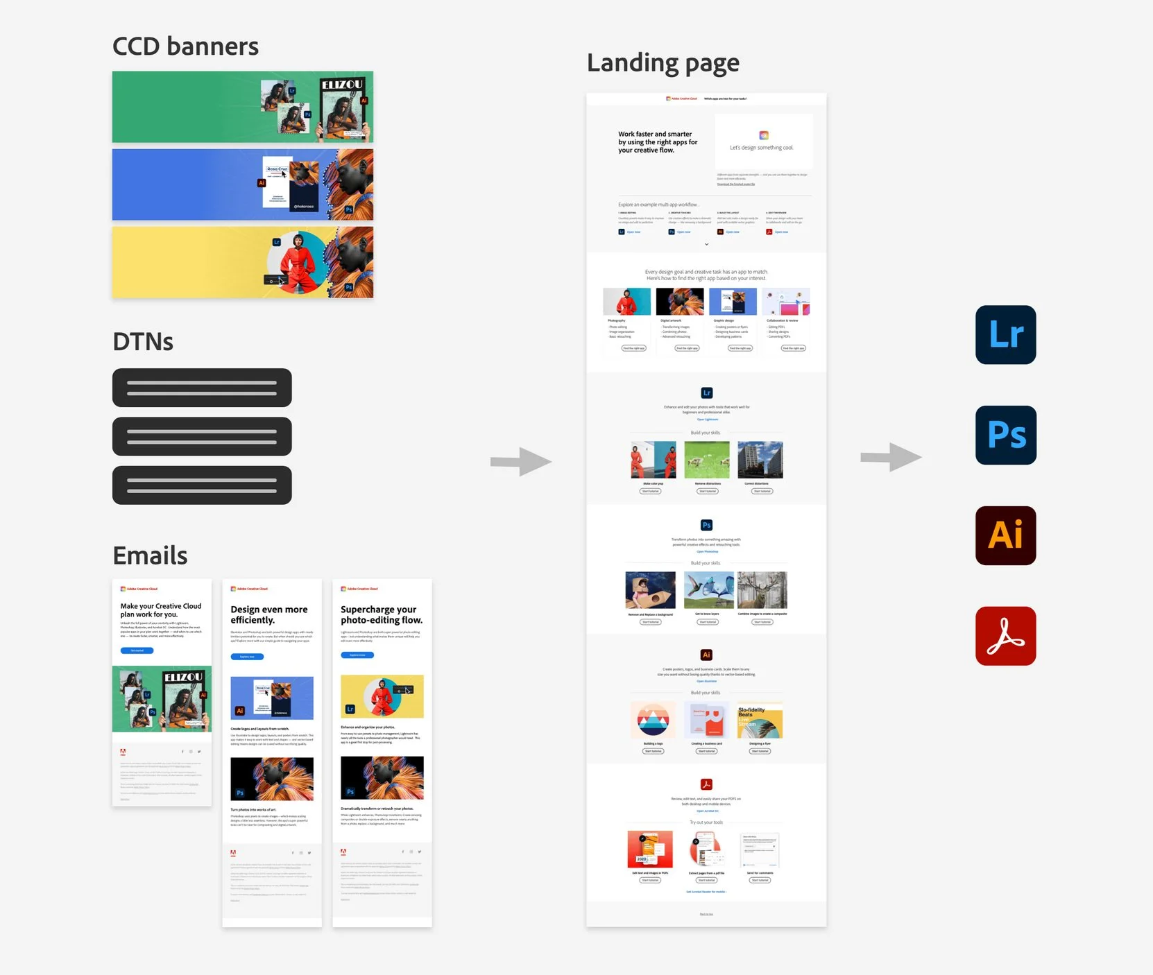
The first experience consisted of a multi-surface campaign:
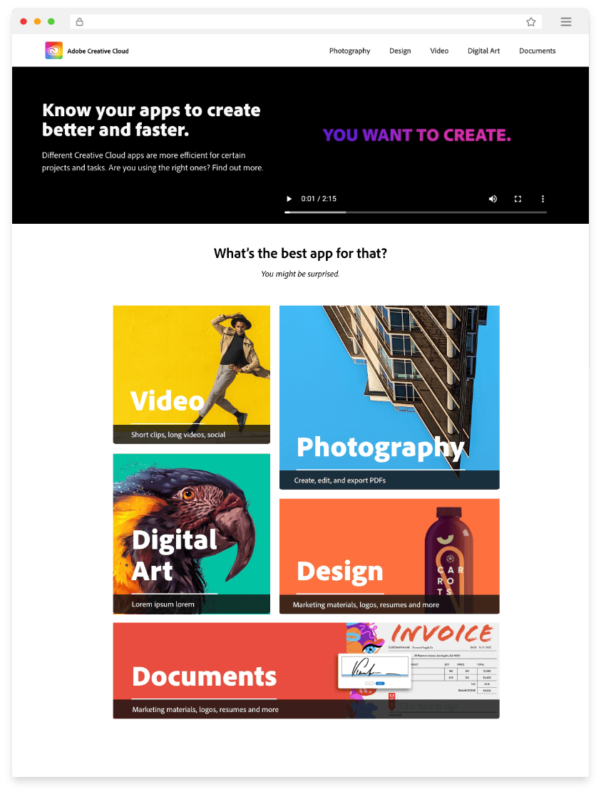
Single page website with original video I created
Multiple links that drove users to in-app tutorials or Adobe HelpX pages
Creative Cloud Desktop notifications
Set of emails
Creative Cloud Desktop banners
The plan
(A) control ✖ (b) challenger → user research → (data + insights) ✖ redesign = the next contender, which app v3
The Control
which app v1
The Challenger
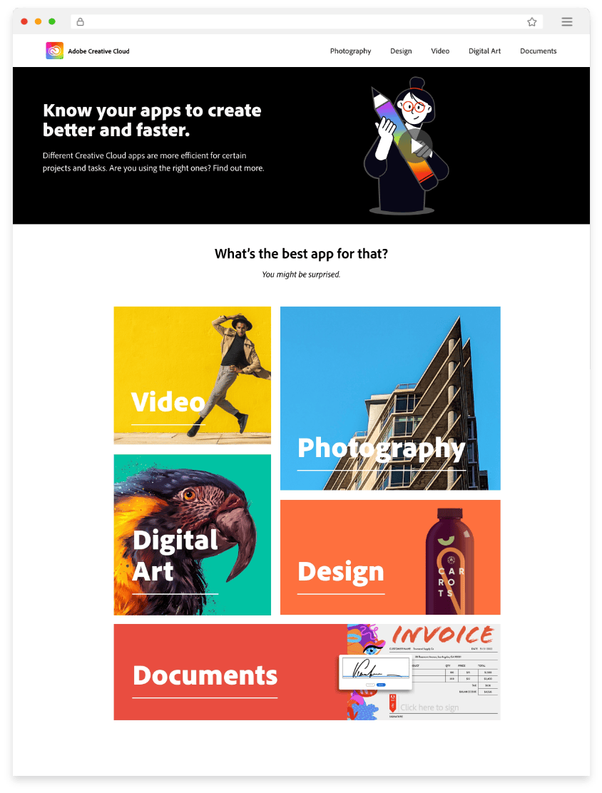
which app v2
user research
(data + insights)
✖ redesign
= v3
T H E C H A L L E N G E R
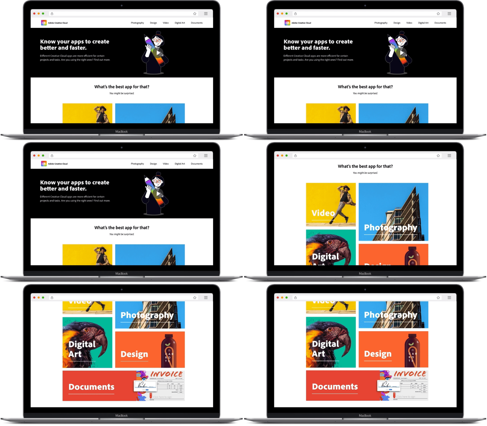
Which App v3

Process
V2 P R O T O T Y P E + U S E R T E S T I N G
My design teammate kicked off “V2” by building several iterations that our whole design team critiqued. Group effort! We finalized the direction and he built the first prototype.
Together, he and I conducted several user tests that surfaced this new prototype to 3 different audiences to tap into each audience’s particular needs, experience, and feedback.
We also wanted to validate our ideas, confirm test hypothesis, and test our prototype on our audience.



V1 P R O T O T Y P E + U S E R T E S T I N G
Since V1 was the first growth experiment, we built v2 and then user tested them both V1 & V2 at the same time, as separate tests.
Since this was my baby, I ran the user test for V1, collected all the data, and synthesized the results into the most salient insights to implement into the next version, V3.
Now it gets good…
D E V E L O P P R O T O T Y P E V 3
At this point, I took over as lead designer, implementing all the insights from our user research, plus everything I’d learned from my years at Adobe, into the next prototype (v3).
Visually engaging, graphically-oriented design
Demonstrate visually (in a variety of ways when possible) what the app does, what use cases and tasks to use it for, and what’s possible with the app (dream big)
Speak in clear, descriptive, non-technical language that allows users to easily grasp concepts
Delivered animations, moving graphics, beautiful imagery, and videos to meet users’ expectations to see these devices when learning new app skills
Links to in-app tutorials as much as possible to usher user directly into the app to practice and learn
Showcase side by side images edited in different programs for users to see and understand difference between apps
Creative Cloud Desktop app banners and desktop notifications
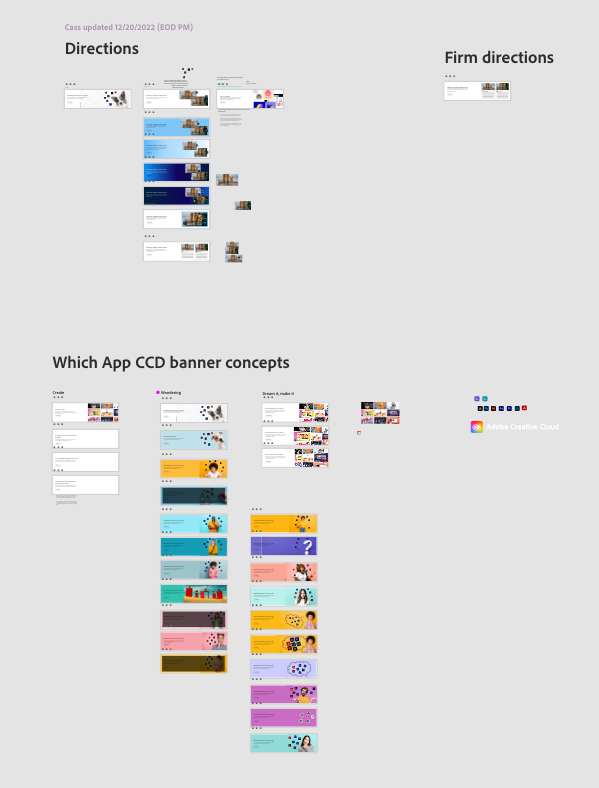
At this stage, I also created graphic banners with copy and CTA, would would be featured in the Creative Cloud Desktop app as a way to engage our audiences.
I brainstormed big picture copy ideas and collaborated with our team copywriter towards the final solution. We also validated our copy and messaging through user testing.
Video assets
I produced a brand new, splashy video to be featured at the top of the Which App home page, teaching myself how to to edit short-form videos in Premiere Pro.
Pulling together different video assets from across the legacy Adobe apps teams, I edited them together into a seamless, single story with an exciting Adobe Stock music track.
Results
notifications
6
10
videos
assets
Audience size
banners
6
Page Website
3
500k
47
W E B S I T E
“What does each app do? How are they different? Which app should I use for my project?”
This was a truly innovative experience. Where previous experiences were limited, Which App was the first that sought to answer user’s fundamental questions about Adobe apps through a unique, visually-focused interactive website that’s both educational and inspirational.
Static
Hover state + video play
Each page features:
30-60s punchy intro videos for each app
Side-by-side comparisons
Task cards with thumbnail image
Before/after image sliders
Links to in-app tutorials and Adobe HelpX pages
Descriptive copy that’s clear and direct
creative cloud desktop app banners
“What do I do with all my apps?”
home page sizzle reel video
“What’s the difference between each app? And what’s possible with them?”
The news:
My pet project didn’t reach stat sig. By the time it launched, I had already left Adobe. The trail ends cold here for me. Before I left, I created an entire presentation about the Which App project, outlined the user problems it attempts to solve, and connected this to the direct impact on certain metrics (thus revenue).
My solution might not have been the right one (yet!!), but in my book, “I only fail if I don’t learn.” My hope is that my project breaks critical ground where there was little to none before it. If anything, it can be used to gain even deeper insight into what kind of solution truly speaks to Adobe creative app users.


