website, logo, & brand redesign
Accrediting Commission for Community and Junior Colleges
In my role as Art Director at Berkeley-based Two Hats Consulting, I led my team through the creative process from initial discovery meetings and client reviews to launch a fresh new website for the Accrediting Commission for Community and Junior Colleges (ACCJC).
Assessment
WEBSITE & LOGO
We sat down with the agency to assess their current brand and website, identify pain points both for front-end users and back-end staff. We also defined their wish-list for the new site.
Previous website
Previous logo & color palette
Identify pain points
No structure for the text-heavy content on site
Multiple columns of copy cumbersome and confusing
Lacking user-friendly navigation system
Missing basic functionality like Search
Outdated logo
Strategic solutions
Sent out survey to acquire staff feedback on current website and identity
Defined agency's new vision, needs, and goals for website and identity system
Solved issues with design thinking
Goals
New, robust website that could keep up with their growth as an organization
Clean, organized, easy to navigate site
New logo and brand identity with improved, refined aesthetic that communicated their expert status
Execution
NEW LOGO & BRANDING
Logo & Color Palette
Incorporating feedback from the logo survey and my one-on-one consultations, I developed a series of simple, minimal logo options that focused on:
Sense of establishment
Touch of elegance and spaciousness
Alternate logo versions for flexibility in various use case scenarios
Expanded color palette
Finalized logo + alternate versions
Iterative logo rounds with color explorations
Custom Illustration
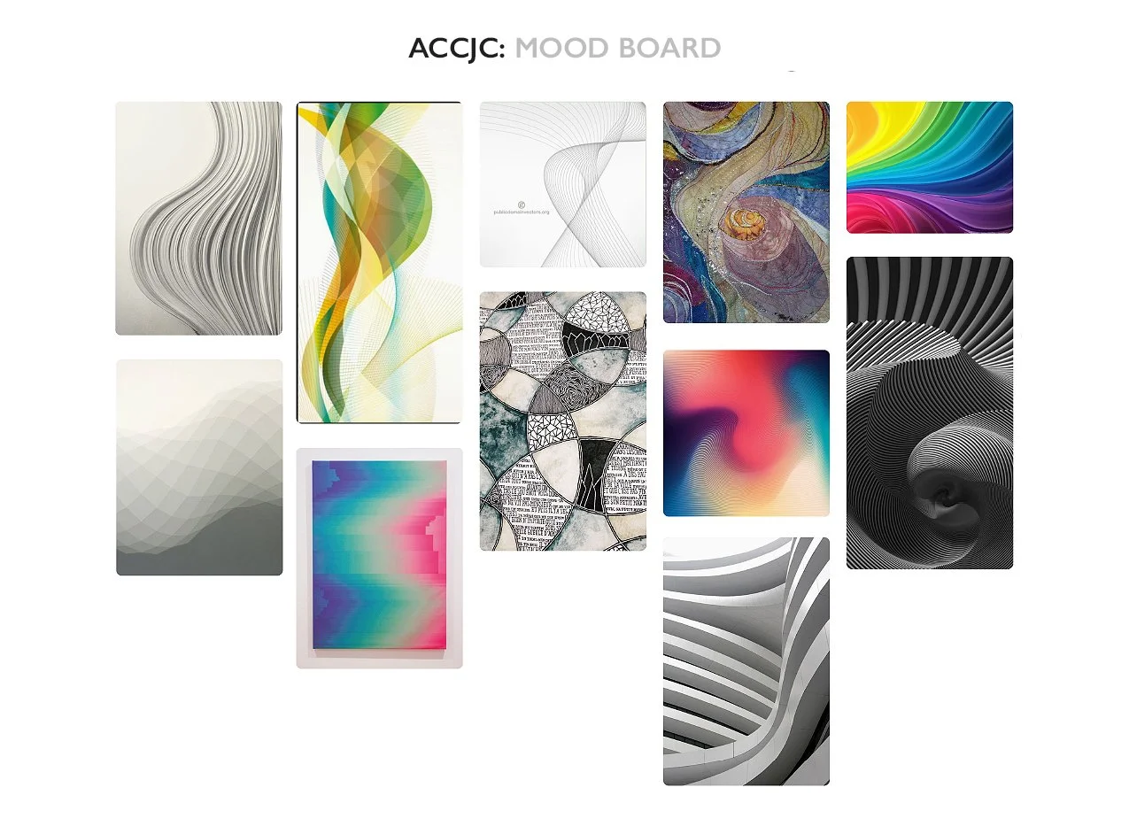
In lieu of photography, the agency wanted an abstract, refreshing digital illustration to leverage across all media outputs.
Lead client through mood board development and iterative comps
Created 3 original digital illustrations
Produced each graphic to be cropped, rotated, and paired with the other graphics to create an endless variety of options
In a rare twist of fate, there were no revisions to my 3 initial comps (designer’s dream!). The client loved each of them so much, she purchased all 3.
Thumbnails of final custom digital illustrations
Typography
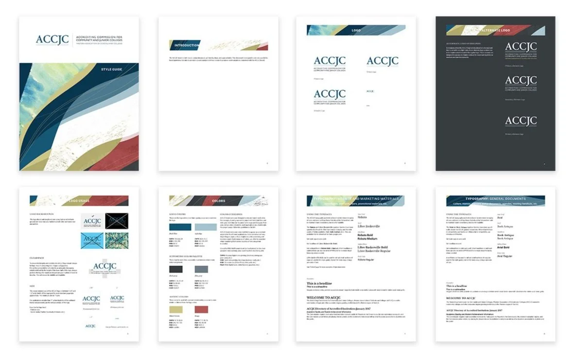
ACCJC needed all internal and external documents to remain visually cohesive and on-brand. I created an extensive style guide to cover all their needs and guide staff on how to use the brand properly.
Two sets of typography, one used by top level staff, designers, and web developers for client-facing materials; the second for all other staff and internal materials, who had access to it on all computers
Detailed style guide
W E B S I T E D E V E L O P M E N T
Whiteboards + Wireframes
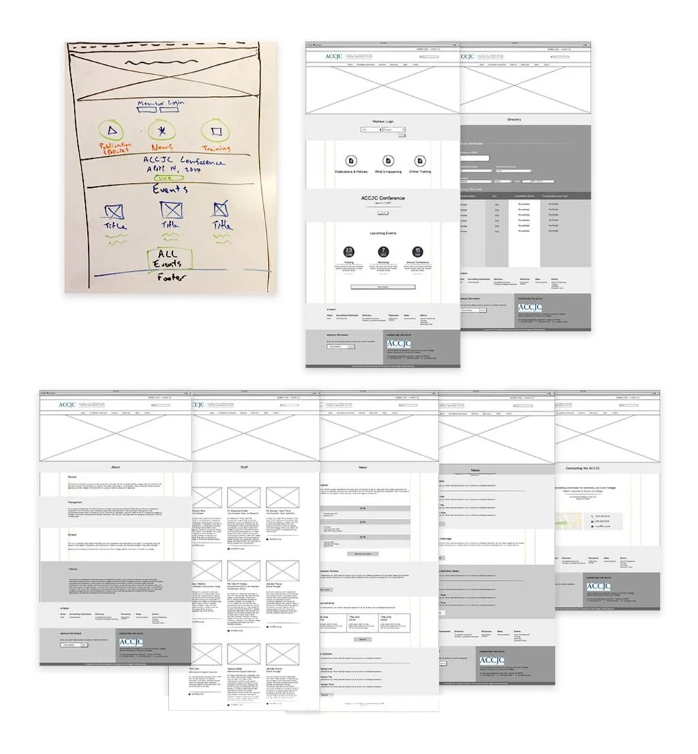
Web development began with team strategy meetings to set the foundation. Together, we brainstormed and fleshed out our ideas and solutions on whiteboards.
Lead team through design thinking
Built quick wireframes in Balsamiq
Co-worked with client and development team to solve issues, troubleshoot, and refine each page’s content and structure
High Definition Wireframes
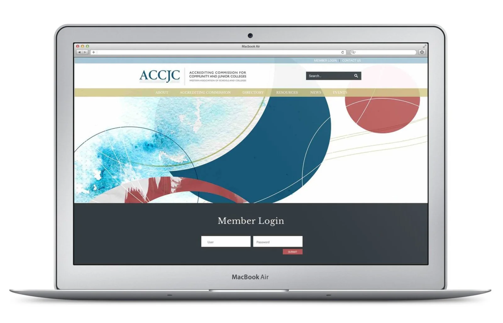
In Sketch, I fleshed out the look and feel of the main pages, solving logistical problems with visually pleasing solutions. Upon final approval from client, the development team took over to build the actual site.
Designed and developed home page and 2 other complex pages to set typography, style, and tone
Delegated remaining pages to designer to build out
Worked with designer and developers to maintain brand consistency and solve arising logistical snafus with pleasing visual solutions


