growth & Ux design
Adobe Premiere Pro Launch Modals
As a Staff Designer on the Creative Cloud Growth Team at Adobe, I worked with product managers and XFN teams to design and execute a variety of A/B and product-led growth experiments that drive activation, retention, and engagement of Creative Cloud products.
Premiere Pro is Adobe’s professional video editing application. When learning how to edit videos, you not only learn the craft itself, but also how to use the app—which can be challenging.
When users are disengaged for too long during a specific time in their tenure, they eventually cancel their Premiere Pro plan [business problem]. Research showed more continual interaction with the app = less cancellations.
This project sought to improve the content and messaging in the launch modal (that pops up when Premiere Pro opens) so that it truly spoke to where users are in their journey and gave them the tools they need to be successful in their projects.
Problem
Why are we seeing low user engagement with the Premiere Pro app amongst our users of 35+ days? Is the current Premiere Pro home screen launch modal experience delivering the best content to help this audience get the most out of the app?
Solution
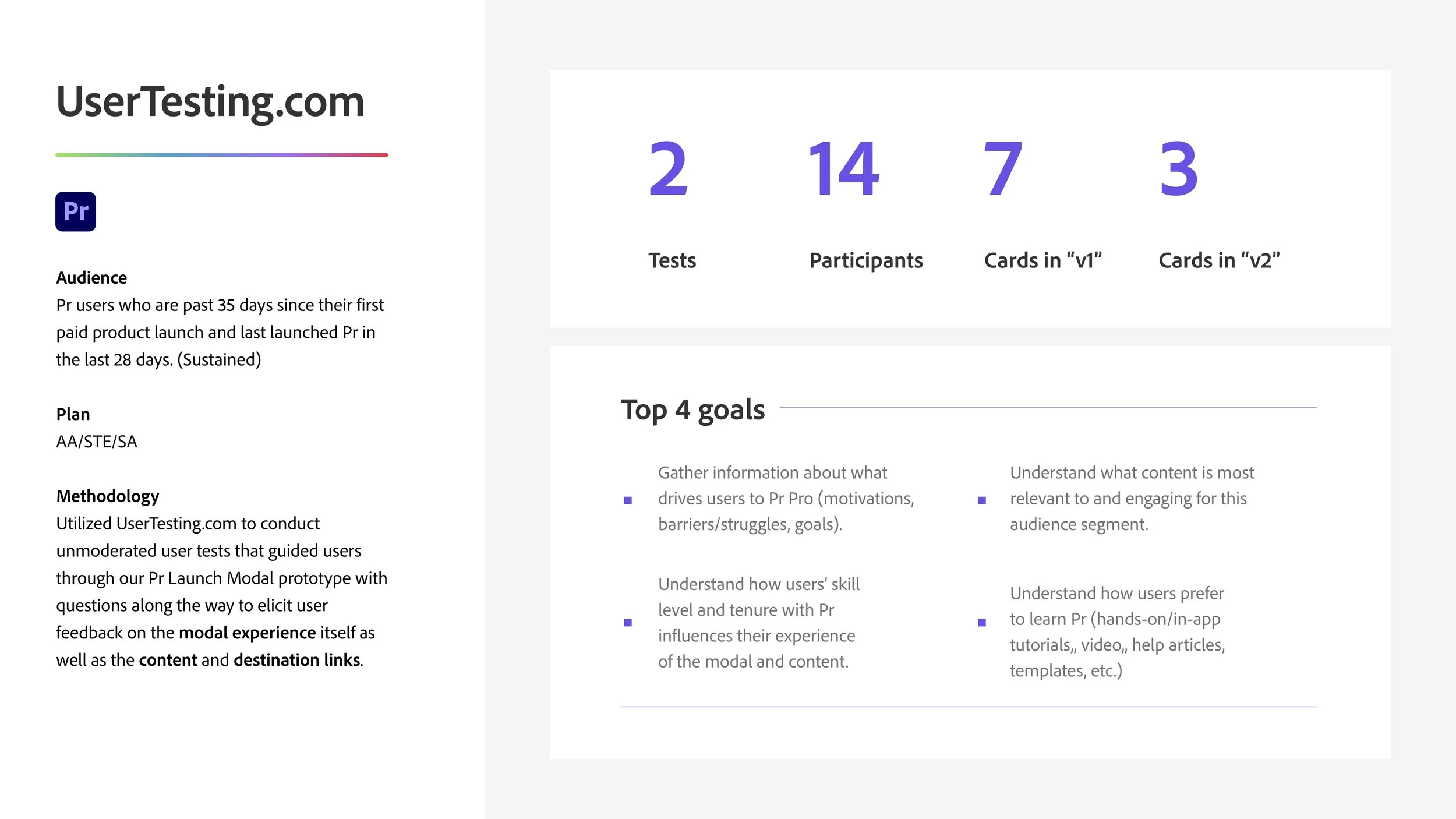
Conduct user research on current Premiere Pro home screen launch modal content to gauge its effectiveness and extract understanding around audience needs, barriers, struggles, and goals.
Using this research-backed data, update launch modal experience with updated copy and new content (as needed).
Then launch A/B growth experiment, setting the current launch modal experience as the Control (A), and new modal content as the Challenger (B).
My role
Lead designer
Video editor
Collaborate heavily with Growth Product Manager and Premiere Pro Product Manager
Copywriting; collab with copywriter
Conduct user research, analyze and synthesize data into actionable insights to leverage for growth experiment
The formula
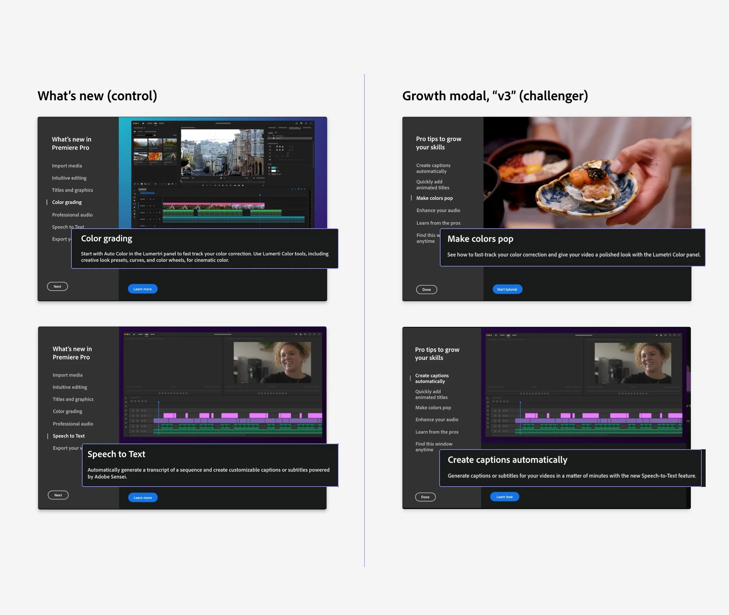
The Control
Launch modals v1
The Challenger
Launch modals v2
(Data + Insights) x Redesign
= v3
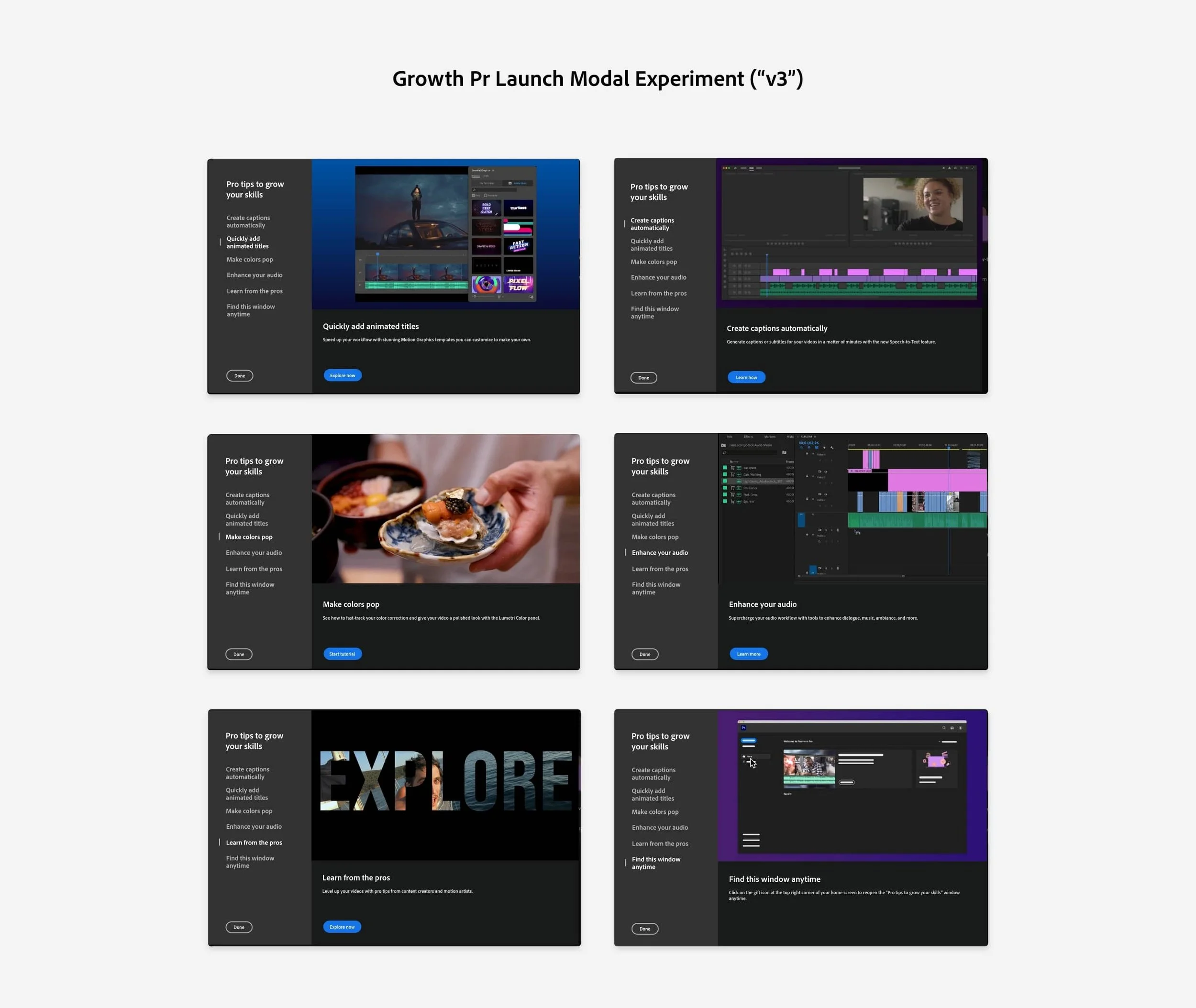
The Emergent Winner (v3)

Process
user research
Test + experiment set up
Product manager and I devised frameworks for user research and growth experiment
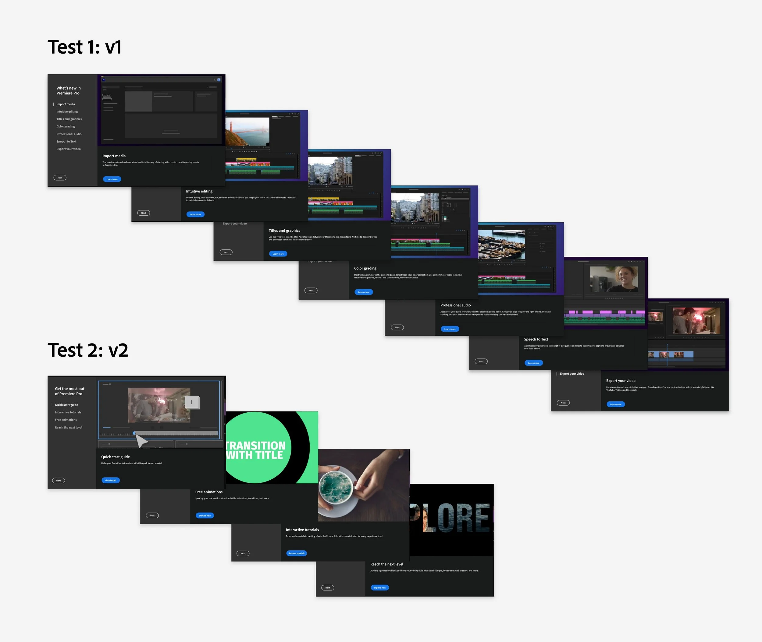
A/B Test = Test 1: v1 = Control 1; Test 2: v2 = Control 2
We launched our first user test (v1) with the current Premiere Pro launch modal experience that had 7 different cards.
Then we launched a second user test (v2) that featured launch modal content from a previous, successful Premiere Pro growth experiment.
As a designer, you do your best, but you can’t always know what’s in the user’s mind, what their needs are, or what they’re struggling with. Conducting user research before executing a design is the best way to test out and validate your ideas, gather critical feedback to implement, and more deeply understand your customers.
As a self-professed nerd and research junkie, this is my JAM.
I consumed loads of user research during my years at Adobe so I could get into the minds of my customers. I wanted to understand the connection between the “business’s problems” and our users’ problems—their struggles, their mindset, what prevented them from being successful with their Adobe apps.
Leveraging user research data and insights to inform updated content and copy for the final launch modal growth experiment experience (v3).
U P D A T E S & I M P R O V E M E N T S
Before/after: Content
Research showed that users didn’t fully understand v1’s titles and descriptions, and were likely to disregard the modal or skip to another modal card. It was too technical and gave no insight into what it actually is.
Rewrote copy in more general, descriptive language
Remove most jargon and technical language to incite clarity and understanding
Before/after: destinations
Each modal linked to destination pages within the Adobe ecosystem that surfaced associated learning content. Users found V1 destinations visually boring and too text heavy. We discovered users prefer and expect learning content to have not only images, but also animated graphics and video content.
Updated destination links to related in-app tutorials and newer, visually exciting help pages that featured videos and animations.
Other (research-backed) notes
Replace all static imagery with motion graphics, animations, and video clips to delight users and assist user comprehension
Remove unhelpful or irrelevant content
Reduced # of cards and rearranged order
Results
We saw an immediate and significant lift in engagement (though I’m not allowed to share specific data). Not only was this growth experiment a success in meeting KPIs and creating a lift, but we also re-ran it several more times on different cohorts where it continued to prove successful with other audiences.
Modal 1
Modal 2
Modal 3
Modal 4
Modal 5
Modal 6


